MICROSOFT 365

·

· LOGO DESIGN

· BRAND IDENTITY

· LOGO DESIGN

· BRAND IDENTITY

· LOGO DESIGN

· BRAND IDENTITY

· LOGO DESIGN

· BRAND IDENTITY

GROOVE RECORDS

Project Type

Case Study for Matte Black Creative Group

Involvement

Logo Design

Brand Identity

Creation Date

June 2023

About

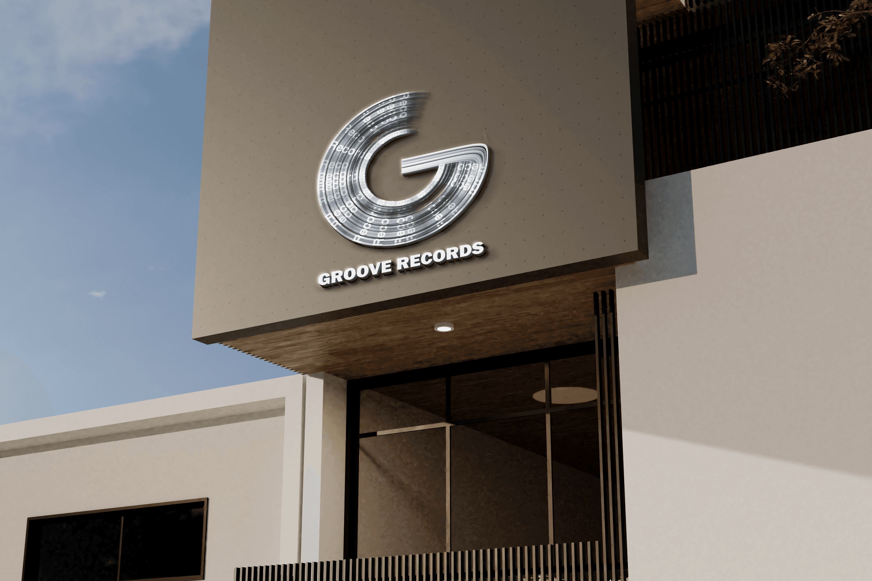
Groove Records—a R&B, soul, and funk record label with the mission to diversify sounds, artists, and people.

Groove Records—a R&B, soul, and funk record label with the mission to diversify sounds, artists, and people.

THE BRIEF

Insight

  • 6 keywords were asked to describe the brand/needs: Creative, Authentic, Diverse, Collaborative, Innovative, Impactful.

  • Competitors include Interscope Records, Atlantic Records, and RCA Records.

  • 52% felt that yellow means joy, 44% associated orange with joy, 25% reported they associated purple with pleasure, royalty

Goal

The primary goals for the logo are to be memorable and recognizable, to communicate our values and mission, and to appeal to a younger and more diverse audience.

Solution

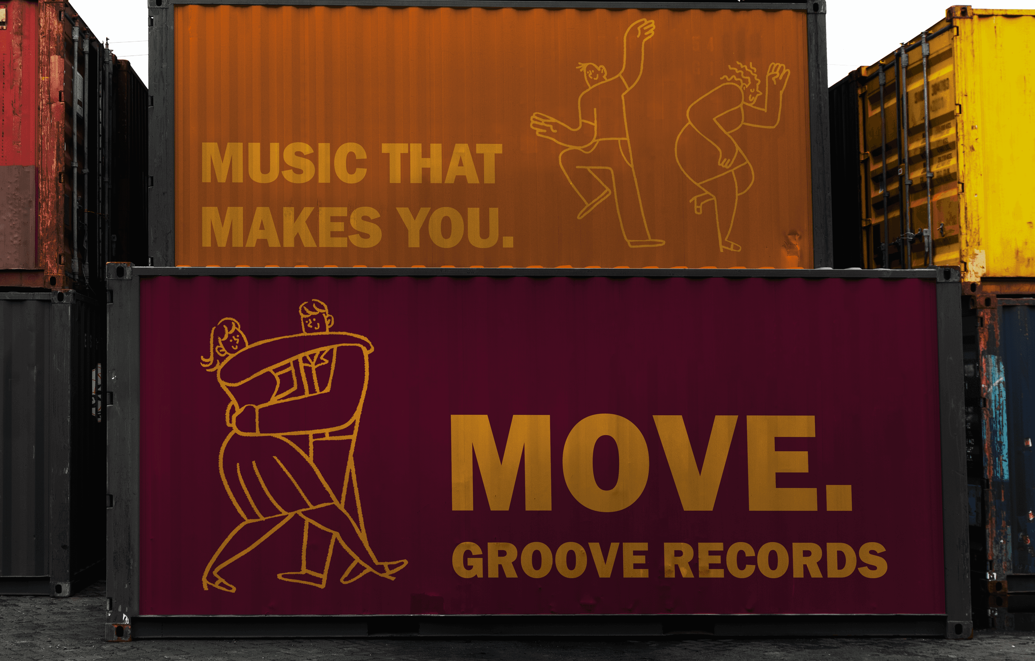
A logo that makes people want to dance, move, groove. A strong and entirely one-of-a-kind logo that does not resemble anything on the market. A challenge to the testimate of logo design disciplines.
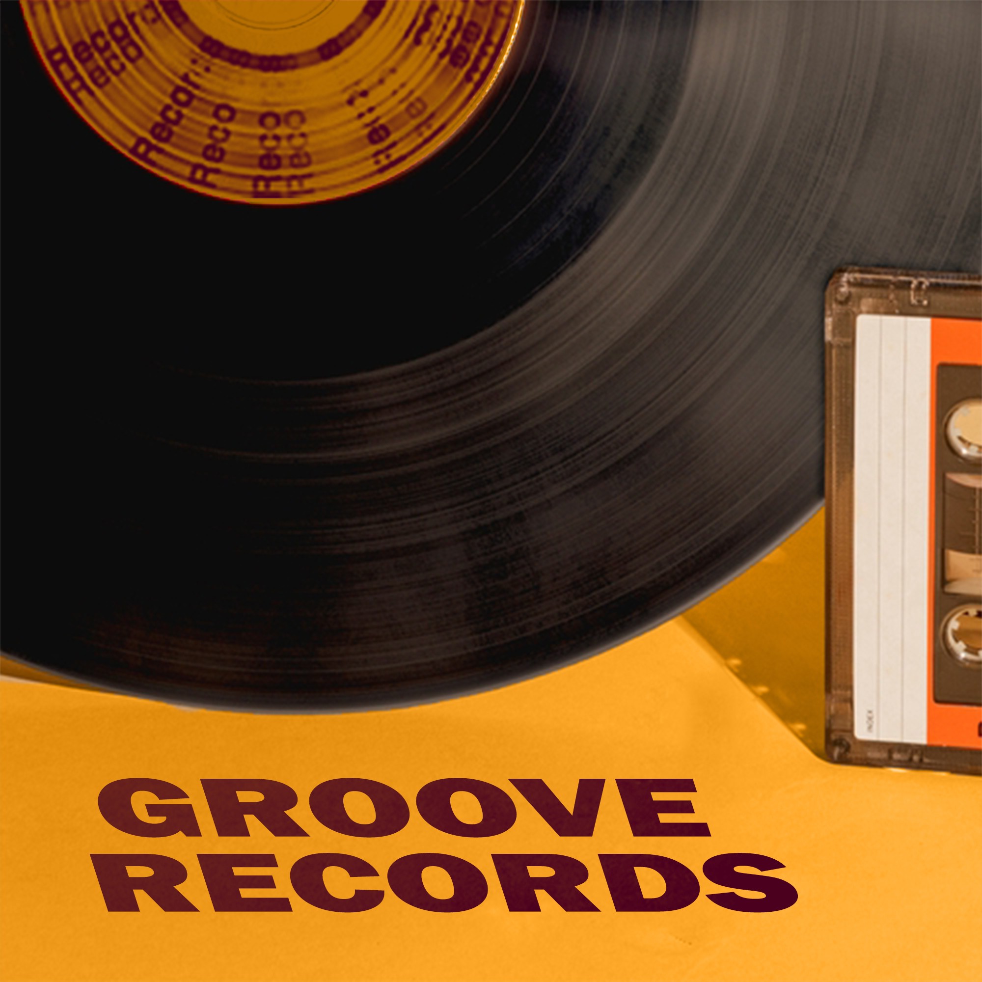
Step #1 Research/Brainstorming

I found that thick lines & fonts bode well for visibility. I saw a ton of usage of circles and soften squares which I wanted to incorporate to communicate "diversity" value Groove Records has.

I found that thick lines & fonts bode well for visibility. I saw a ton of usage of circles and soften squares which I wanted to incorporate to communicate "diversity" value Groove Records has.

Step #2 Sketching

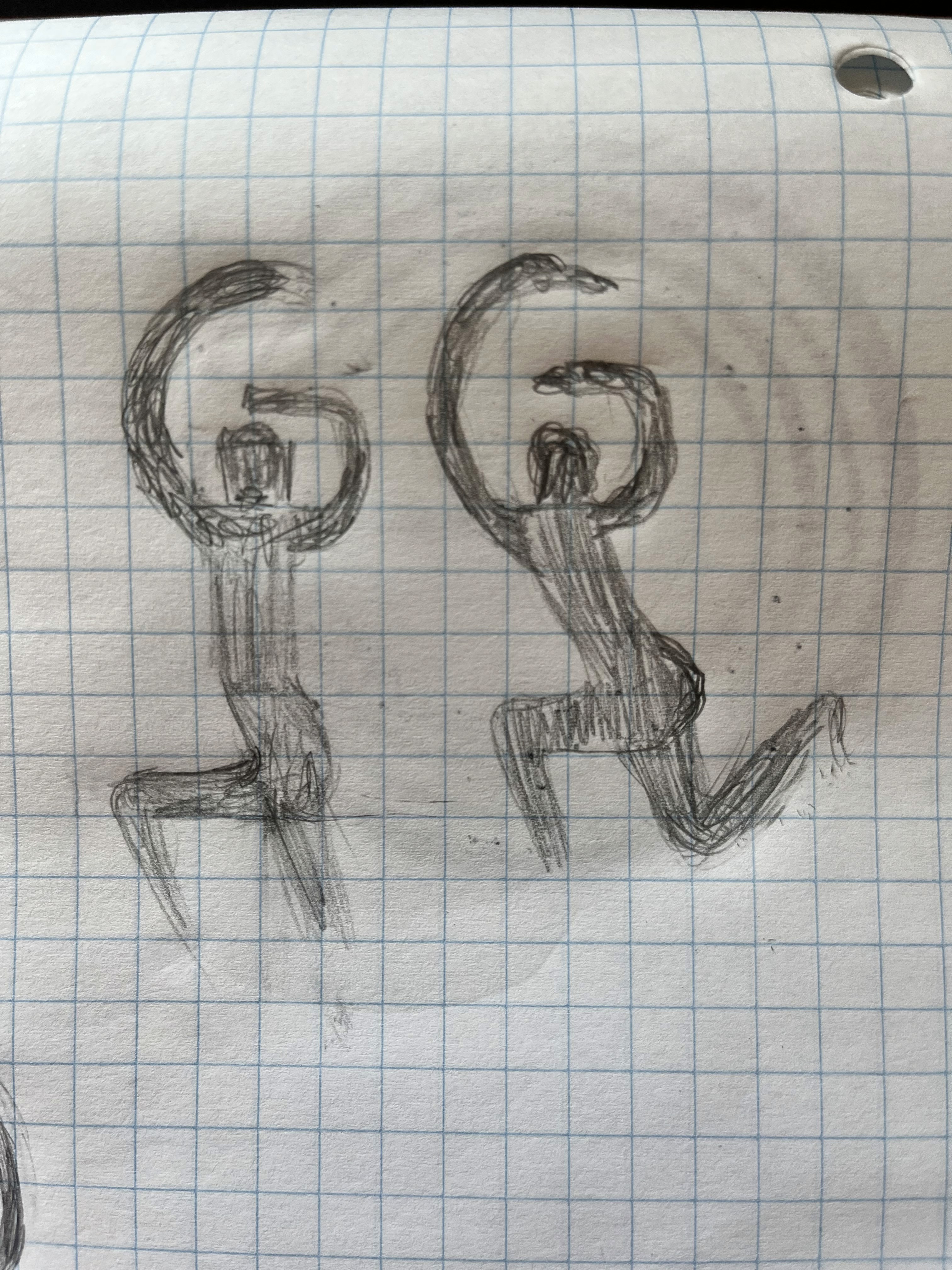
There's a reason I'm not a surgeon— Signets were the focus. I wanted to design a scaleable, unique, creative, modern, and fun logo as requested by the client. I played with morphing shapes and letters into each other. This is continued through the process.

There's a reason I'm not a surgeon— Signets were the focus. I wanted to design a scaleable, unique, creative, modern, and fun logo as requested by the client. I played with morphing shapes and letters into each other. This is continued through the process.

Step #3 Refinements

Can you tell it was my first time designing a logo? The client loved the 3rd design in the row above thus the four rounds of revision.

  1. A wireframing was attempted in the first time with uncertainty, on my part, of how to fill inner part.

  2. On the second revision, I focused on trying to get the 'ideal texture' that would be inside the shape. Feedback was to clean up the shape and add the workmark.

  3. The third revision is an approach to merge the previous steps. A request was made to make the tail in the "G" blended to the shape. In addition, the client liked the detressed edges in revision #2 and wanted to add that back in a clean way.

  4. The final revision and final product includes the clean distressed edges. Franklin Gothic Black is used as the wordmark typeface.

Can you tell it was my first time designing a logo? The client loved the 3rd design in the row above thus the four rounds of revision.

  1. A wireframing was attempted in the first time with uncertainty, on my part, of how to fill inner part.

  2. On the second revision, I focused on trying to get the 'ideal texture' that would be inside the shape. Feedback was to clean up the shape and add the workmark.

  3. The third revision is an approach to merge the previous steps. A request was made to make the tail in the "G" blended to the shape. In addition, the client liked the detressed edges in revision #2 and wanted to add that back in a clean way.

  4. The final revision and final product includes the clean distressed edges. Franklin Gothic Black is used as the wordmark typeface.

How the hell did I make this?

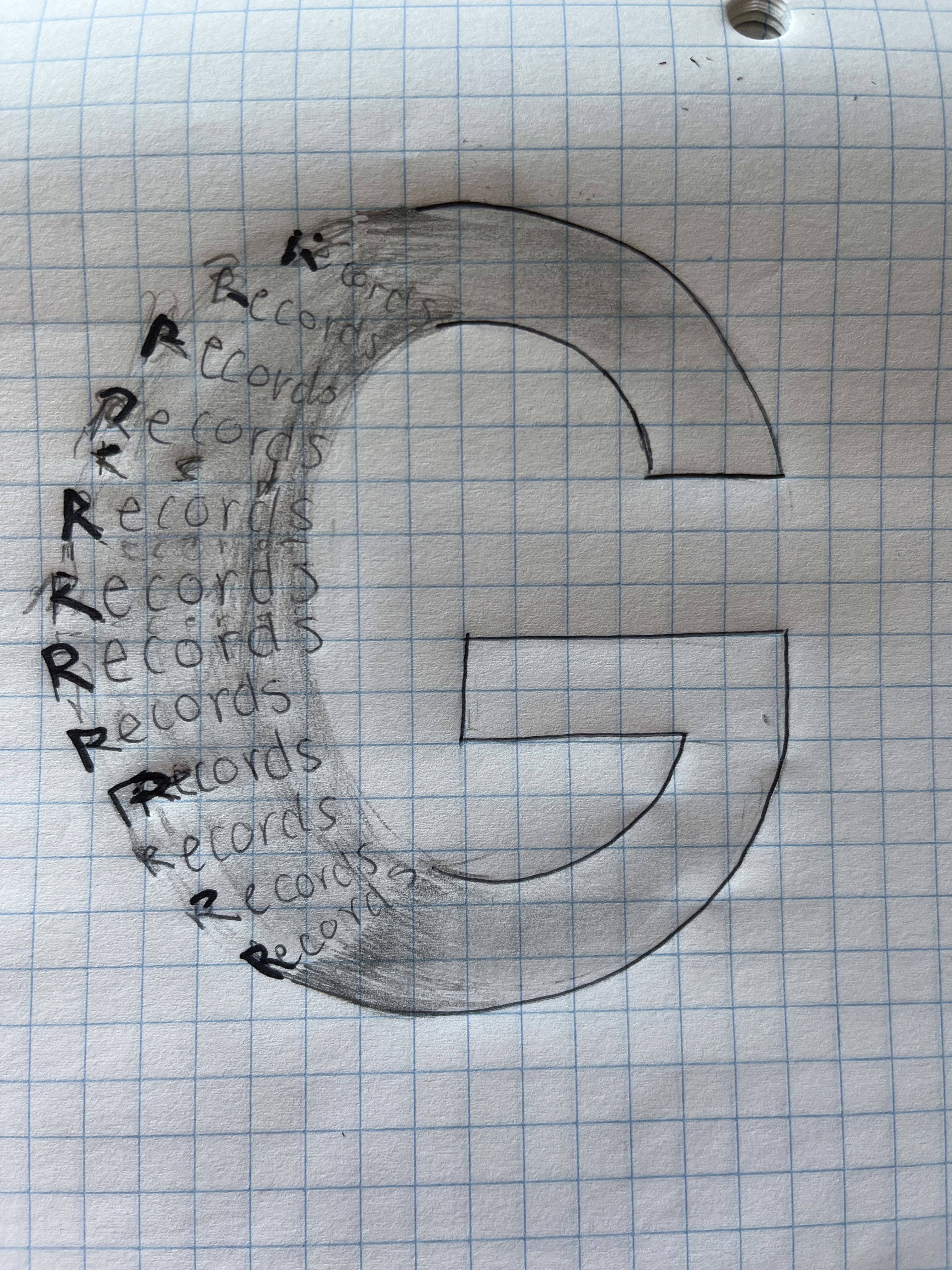
Hours of trying to figure out how to rotate "records" in a consistent circle. Image tracing multiple vectors and images of vinyl records, and blending them to make the blurred spin texture. Taking the vinyl image and rotated "records" and applying layer masks in variations while rotating the vinyl to provide a variety of textures. After all those layers/textures were applied, I radial blurred the canvas. And I'm not even going to explain the tail…

Hours of trying to figure out how to rotate "records" in a consistent circle. Image tracing multiple vectors and images of vinyl records, and blending them to make the blurred spin texture. Taking the vinyl image and rotated "records" and applying layer masks in variations while rotating the vinyl to provide a variety of textures. After all those layers/textures were applied, I radial blurred the canvas. And I'm not even going to explain the tail…

JANNICA
SERAYPHEAP

Book a Consultation with Me!

Janseraypheap@gmail.com

JANNICA
SERAYPHEAP

Book a Consultation with Me!

Janseraypheap@gmail.com